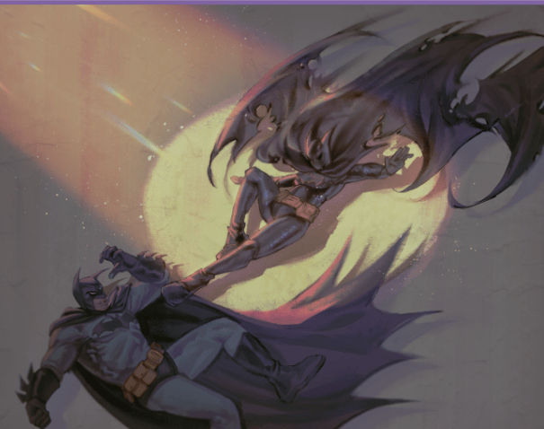
Batman VS. Batgirl
Project Scope / Role
• Illustration
• Composition & Lighting Design
• Narrative-driven Visual Storytelling
The Challenge
I wanted to create a piece that felt more than just a fight scene. The challenge was to capture the duality of power and vulnerability between two iconic figures, frozen in a single charged moment. It had to be cinematic, alive with motion, and emotionally gripping—like a still frame from a larger story.
My Solution & Process
I started with the idea of duality—light against dark, agility against strength, chaos against control. The spotlight became my anchor: a harsh beam cutting through the shadows, symbolizing truth and confrontation. From there, I sketched dynamic poses that created a diagonal tension, pulling the eye across the canvas.
Painting the final piece, I carefully balanced detail and clarity. Batman’s form is heavy and grounded, while Batgirl explodes forward with fluid precision. The background was intentionally muted, with streaks of light and subtle grit to suggest Gotham’s atmosphere without stealing focus. Every choice—color, anatomy, shadow—was about amplifying the story of this clash.
The Artwork / Outcome
The result is a frozen instant of intensity: two forces colliding under the harsh honesty of light. Batman leans back, solid but vulnerable, while Batgirl moves with sharp agility, her form almost merging with the shadows behind her. The golden glow frames them both, turning their confrontation into something mythic—less about who wins, and more about what each represents.
For Clients
What I love most as an illustrator is capturing emotion and atmosphere within a single frame. My focus is on creating visuals that don’t just look striking but tell a story you can feel. If you’re looking for artwork that blends cinematic energy with narrative depth—whether for games, comics, or campaigns—I bring that passion for storytelling to every piece I create.
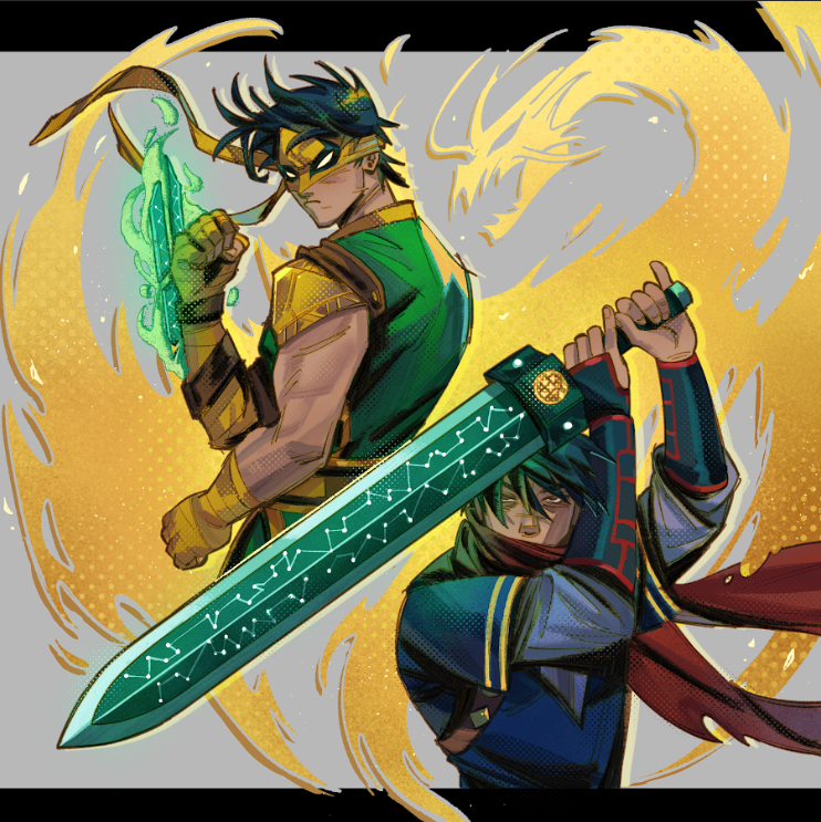
Lin Lie – One Legacy, Two Paths
Project Scope / Role
• Character Illustration (key art)
• Composition & Symbolic Worldbuilding
• Color & Lighting Direction
The Challenge
This piece needed to honor one character living two destinies. Before he became the Iron Fist, Lin Lie was a sword master—fast, stubborn, brilliant. After the Sword of Fu Xi shatters and Shou-Lao saves him with chi, he inherits a mantle that is heavier, older, and far more spiritual. My challenge was to fold those timelines together so viewers feel both stories at once—blade and chi, past and present—without looking like two different people.
My Solution & Process
I designed the composition as a mirror of the same soul. On one side: the swordsman—edges, angles, and the emerald blade etched like constellations, a nod to the Sword of Fu Xi’s mythic lineage. On the other: the newly chosen Iron Fist—the stance tighter, the gaze steadier, green chi pooling in his hand. To bind the two, I let a golden dragon silhouette swirl behind them—Shou-Lao as living motif—so the eye loops through both versions of Lin Lie and lands back on the idea of destiny. I kept the palette in greens and golds (growth and legacy), layered halftone textures for a print-poster feel, and pushed the lighting so metal reads crisp while energy reads soft and living. Every mark is meant to feel like motion caught mid-breath.
The Artwork / Outcome
The illustration freezes Lin Lie at the cusp of transformation. The sword side carries momentum—cut, leap, decision. The Iron Fist side carries purpose—weight, discipline, resolve. The dragon binds them, turning a split portrait into a single legend. Even without text, I want fans to read the lore: Sword Master becoming Iron Fist, not as replacement, but as evolution.
For Clients
I love projects that require respect for canon and room for reinvention. My process blends research (to stay lore-accurate) with bold, cinematic design (so the art can stand as key visuals for games, comics, or marketing). If you need character artwork that communicates myth, motion, and meaning in a single frame, I’m all in—from thumbnails and symbolism to polished, production-ready art.
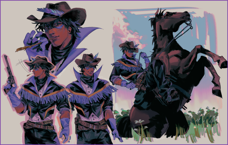
Project Scope / Role
• Character Reimagining / Fan Illustration
• Concept & Costume Design
• Character Sheet / Key Poses & Scene Study
The Challenge
I wanted to take an urban acrobat—angular, lithe, and very modern—and place him in a completely different world: the wide, dusty skies of a frontier-west setting. The challenge was to preserve Nightwing’s recognizability and personality while giving him authentic western clothing and gestures, and still make the design feel like it belongs in the same story universe as my other pieces.
My Solution & Process
I began by identifying the visual cues that make Nightwing, Nightwing: the confident tilt of the head, the iconic eye mask, the athletic silhouette and that playful, roguish energy. From there I sketched dozens of thumbnails to test how those cues translate into cowboy staples—hat, fringe jacket, bandolier, and a trusty revolver—without losing the character’s essence.
I focused on silhouettes first so the design reads instantly from distance: the hat + mask combo keeps his hero identity intact; the slim, athletic posture keeps his acrobatic feel. Color-wise I kept cool blues and teals as the core to echo his classic palette, then introduced warm magenta rim-lights and golden highlights to place him in a sunlit dusk environment. For texture and mood I used halftone dots and painterly brush strokes to give the piece a tactile, poster-like quality. Lastly, I painted a dynamic study of him riding a rearing horse — a single-frame story beat that sells the world and the character in one image.
The Artwork / Outcome
The result is a cohesive character sheet that reads like a snapshot from a western pulp: Nightwing’s grin and the playful feather in his hat show his swagger; the fringe jacket and cartridge belt root him in the frontier; the rearing-horse study sells motion and scale. The layered lighting (cool body tones with warm rim light) keeps him grounded in hero aesthetics while the color choices place him in a golden-hour prairie. Overall, the piece shows a character who is both familiar and newly surprising — still the nimble protector you know, now with a cowboy’s grin and a horse’s saddle under him.
For Clients
I love reimagining established characters and creating designs that feel both respectful of canon and fresh in interpretation. I can provide marketable character sheets, promotional key art, poster layouts, and stylized reinterpretations that work for campaigns, prints, or licensed fan projects. If you want character art that balances identity, narrative, and strong visual impact — especially for promotional visuals or concept-driven work — I bring research, iteration, and bold design choices to the table.
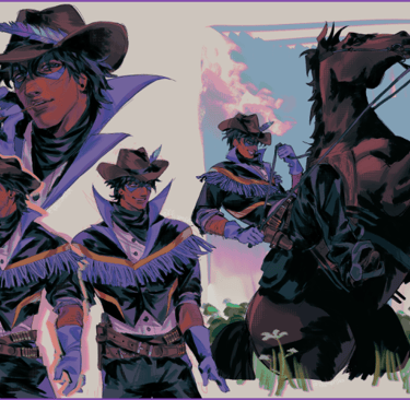
Nightwing: Frontier Echoes
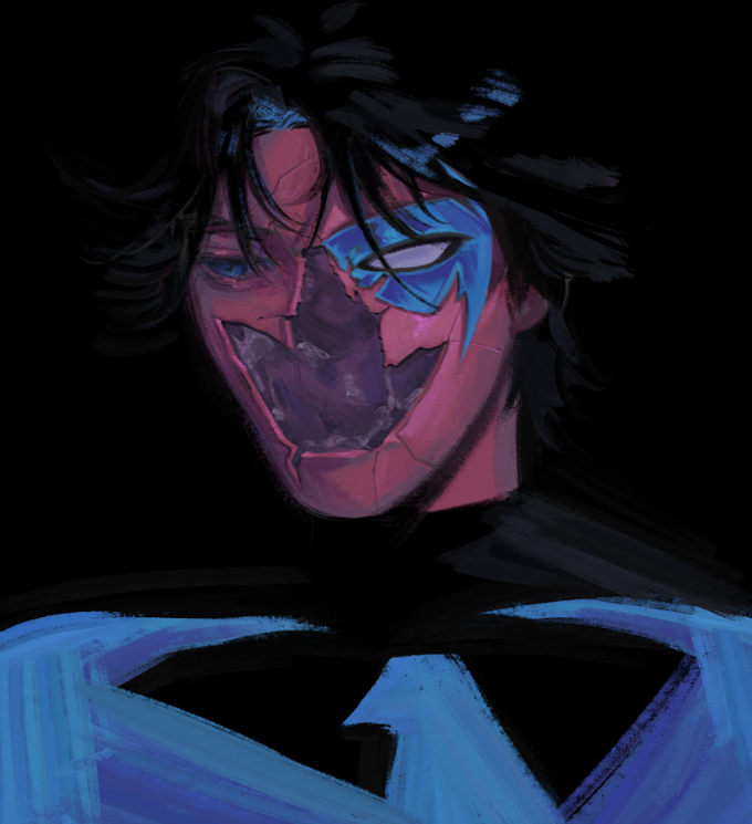
Project Scope / Role
• Character Portrait / Mood Study
• Key Art & Visual Experimentation
• Textural & Lighting Direction
The Challenge
I wanted to capture a single, unsettling moment: a face that’s both familiar and fractured, where identity is breaking apart but still watching you. The challenge was to make that feeling immediate in a close-up portrait — to use color, texture, and minimal composition so the emotion reads at a glance.
My Solution & Process
I started small: thumbnails to lock a strong silhouette and a single focal point — the eye. From there I built a simple underpainting in cool blues to anchor the figure in night, then introduced magenta and violet passes to create a bruised, nocturnal palette. The “fracture” was painted using hard-edged shapes blended into painterly textures, then layered with halftone and noise to give it a tactile, printed feel.
Technically, I leaned on textured brushes and layer blend modes to get the glowing teal of the eye and the subtle translucence of the cracked mask. I kept the edges loose for hair and clothing so they don’t compete with the face; this makes the portrait feel like a single-frame story, full of tension and unanswered questions.
The Artwork / Outcome
The final piece reads like a moment from a dark myth: the fractured mask hints at violence and rebirth, the glowing eye reads as intent, and the limited palette intensifies the atmosphere. It’s less about clarity and more about mood — inviting the viewer to fill in the story. I wanted this to feel like a whisper in the dark that leaves you unsettled and curious.
For Clients
I specialize in portrait work that leans into emotional storytelling — cover art, character posters, mood key visuals, and cinematic portrait studies. If you want artwork that communicates psychological depth, atmosphere, and a strong visual identity in a single frame, I can deliver pieces that fit marketing, concept, or print needs while remaining artistically bold.
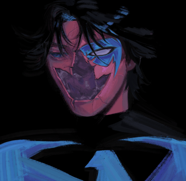
Fractured Night — Portrait Study
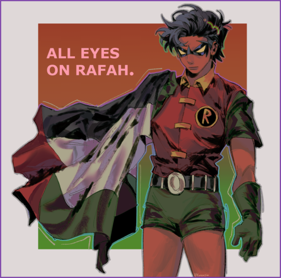
Robin — All Eyes On Rafah
Project Scope / Role
• Illustrated Poster / Key Visual
• Character Rendering & Costume Design
• Composition, Typography, and Color Direction
The Challenge
This piece was about more than just rendering a comic character. I wanted to merge pop culture iconography with a global message of urgency. The challenge was to keep Robin’s strong, heroic stance intact, while allowing the headline All Eyes on Rafah to become a powerful focal point. Balancing character illustration with a political statement meant finding a tone that felt striking but respectful.
My Solution & Process
I began with the idea of Robin as a symbol: a character associated with resilience, rebellion, and youthful courage. Placing him against a bold orange-red square gave immediate visual weight, while the Palestinian flag draped across his body transformed the piece into a layered message.
The process unfolded in structured stages:
Sketch & Composition — choosing a slightly angled, grounded stance that communicates strength without aggression.
Color Blocking — pairing the orange backdrop with green highlights for a vivid yet balanced contrast.
Lighting & Depth — using rim light to carve the figure from the flat background, giving him presence.
Texture & Typography — halftone textures and rough brushwork lend a print-poster quality, while bold sans-serif typography ensures the words are impossible to ignore.
By combining the familiar (Robin’s recognizable silhouette and costume) with the specific (the flag, the headline), I created a poster that reads both as pop-culture art and as a moment of solidarity.
The Artwork / Outcome
The finished piece captures Robin mid-stance, cloak unfurling like a flag in motion. The phrase ALL EYES ON RAFAH anchors the composition, confronting the viewer directly. The textures and color palette give it the immediacy of a protest poster while maintaining the polish of a digital illustration.
The outcome is both a standalone artwork and a visual statement—designed to circulate widely on digital platforms, while also being printable as a poster or cover image without losing impact.
For Clients
I enjoy creating illustrations that carry both aesthetic and narrative weight. This project shows how character art can become more than just a portrait: it can channel cultural or political resonance, connect with audiences emotionally, and adapt seamlessly across digital and print contexts. For brands or campaigns seeking artwork that is visually compelling yet deeply communicative, I can deliver from concept to production-ready visuals.
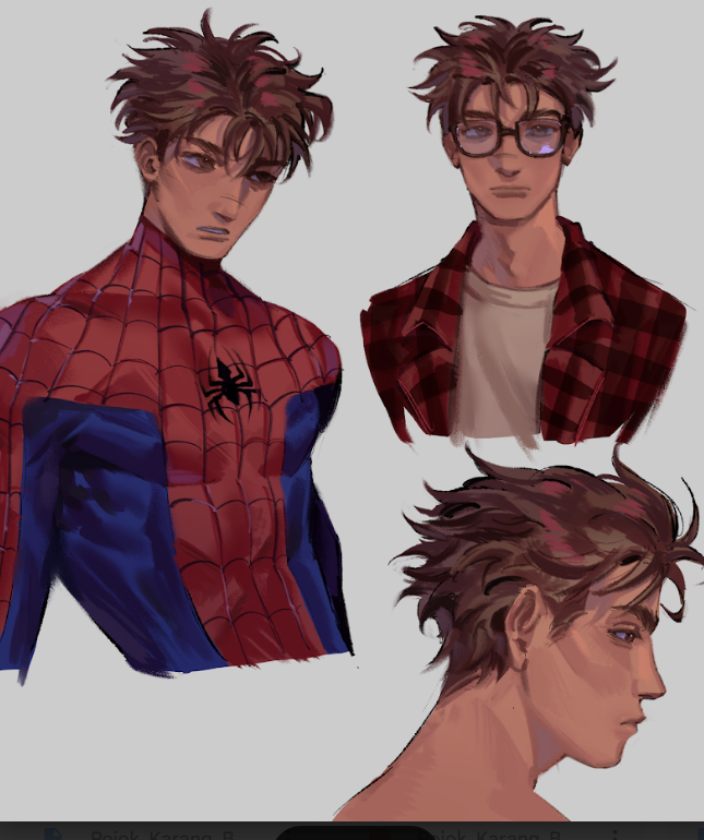
Peter Parker — Quiet Before the Web
Project Scope / Role
• Character Study / Portrait Sheet
• Costume vs. Civilian Design (Spider suit & Peter Parker outfits)
• Expression, Hairstyle, and Lighting Direction
The Challenge
I wanted to show the same person in three different truths: the awkward, thoughtful kid behind the glasses; the tired, determined hero under the mask; and the private profile that holds his doubts. The challenge was to keep all three reads clearly Peter Parker—not just three pretty heads—so the sheet would feel like a single character study rather than random portraits.
My Solution & Process
I approached this like a short scene in a movie. First I sketched quick thumbnails to lock silhouettes and emotional beats: the suit’s tension across the chest, the soft slump of a casual shirt, the quiet profile that suggests thought. From there I worked in layered passes:
• Underpainting & values to establish form and keep the faces grounded.
• Color choices: warm, slightly sunburnt skin tones to give Peter a lived-in look, paired with the classic red/blue of the suit but muted so it feels worn and believable.
• Textures & brushwork: deliberate painterly strokes for hair and fabric, subtle cross-hatching in shadow to add grit; I used soft highlights on the glasses and the suit’s planes so each surface reads differently.
• Expression work: small adjustments to the eyebrow, the tilt of the mouth, and the jawline made the biggest emotional difference—Peter’s vulnerability lives in tiny gestures.
I kept edges loose around the hair and shoulders so the eyes are naturally drawn to the face and costume details. The result is a cohesive sheet where each study feeds the next—same person, different roles.
The Artwork / Outcome
This piece functions as both character exploration and practical reference. You get the hero’s posture and suit silhouette, a civilian headshot that communicates personality, and a profile that reads like a moment of private reflection. Together they tell: this is someone who jokes, worries, and chooses to stand up anyway. The treatment is useful for concept development, pitch visuals, or as a reference for animation and comics.
For Clients
I love character-focused work that prioritizes who someone is over just what they look like. I can turn a concept into usable assets—expression sheets, costume turnarounds, key art—that read well across media (social, print, animation). If you need a portrait or study that balances emotional truth with production-ready clarity, I’ll build the visual language and keep edits direct and collaborative.
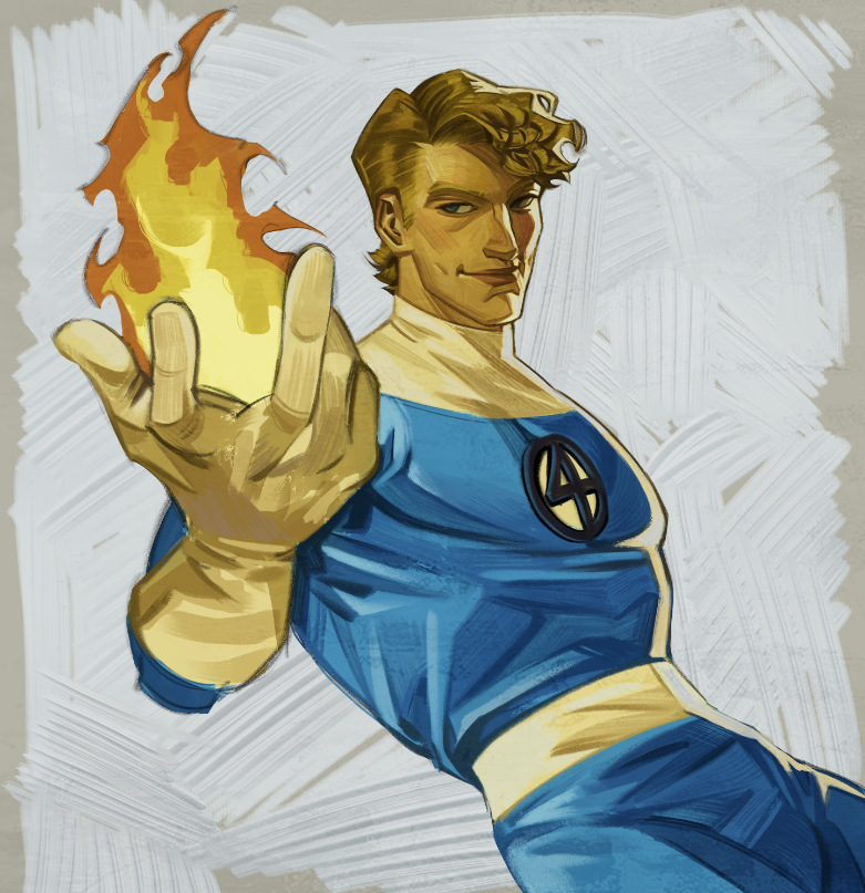
Johnny Storm — Style Study
Project Scope / Role
• Personal style study / fan illustration
• Character pose & foreshortening study
• Color, texture, and poster composition
The Challenge
I wanted to take a classic comic hero and strip the scene to one powerful moment: a reach toward the viewer that reads like both an invitation and a warning. The challenge was balancing painterly texture and sketch energy with clear anatomy and poster-level readability — so the piece looks loose and alive, while still functioning as a strong visual asset.
My Solution & Process
I started with small thumbnails to lock the dramatic foreshortening and the camera angle — the hand had to dominate without swallowing the character. From there I built the piece in layers: underpainting for form, block colors for flame vs suit, then lighting passes to define planes.
For the flame I used warm passes with additive highlights and a soft bloom layer; for the suit I worked cooler blues with midtone modeling and subtle cross-hatching to keep the fabric tactile. The background is intentionally sketchy — rough strokes and halftone textures give the piece a printed-poster feeling and let the figure remain the star.
I kept the process experimental: I pushed brush textures, let edges soften in the hair and jacket, and sharpened only the critical focal points (the eye line, the emblem, and the fingertips).
The Artwork / Outcome
The finished study is a poster-forward portrait that reads at both large and medium sizes: bold foreshortening, clear color hierarchy, and a lively painterly finish. It’s not a production turnaround — it’s a stylistic statement that shows how I can blend dynamic figure drawing with expressive painterly techniques. For viewers and clients it’s meant to feel immediate and tactile, like a printed poster that still breathes.
For Clients
If you’re looking for key visuals, poster art, or stylized character portraits that need to hit fast on social and print, I can deliver work in this direction. I balance strong figure work with texture-driven finishes so the art reads across formats — from thumbnails to A2 prints. If you want, I’ll also prepare production-ready variations (clean emblem, printable crop, and a version with stronger lighting passes) to suit campaign needs.
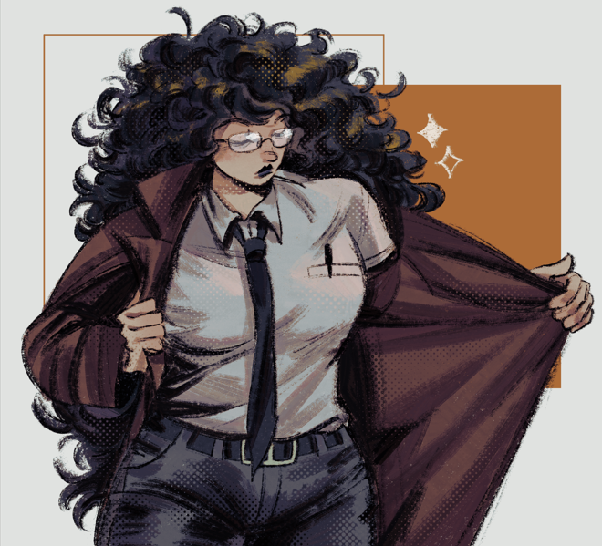
Confident Woman — Commission
Project Scope / Role
• Commissioned Character Illustration
• Costume & Gesture Design
• Final Key Art for client use (portrait / promo asset)
The Challenge
The brief was simple in words but layered in meaning: the client wanted a character who reads confident, a little imposing, and quietly charismatic — someone who can stand at the edge of a scene and immediately claim attention. My task was to translate that personality into posture, costume, and visual tone while delivering a piece that works as a standalone asset for the client’s needs.
My Solution & Process
I always begin with silhouette and attitude. For this project I explored dozens of tiny thumbnails to lock a posture that says “confident” without shouting it: a subtle lean, coat held open like an invitation (or a reveal), chin slightly lowered, eyes behind glasses that catch light instead of hiding emotion.
From there I refined costume elements that support personality: a crisp white shirt and narrow tie for authority, a long coat with clear movement to add drama, and the little details — pen in pocket, feather in hat — that make the character feel lived-in. I kept the face warm but reserved, letting hair volume and glasses become character anchors.
Technically I worked with layered painterly passes: an underpainting to set values, color passes to define warm midtones and cooler shadows, and halftone/noise overlays to give the piece a tactile, print-friendly texture. I used accent rim-lighting (warm orange) to separate the figure from the negative space and a muted background block to focus attention on the character’s gesture.
Throughout the process I collaborated with the client — taking direction on expression and small costume choices — and kept iterations tight so the final felt immediate and purposeful.
The Artwork / Outcome
The finished illustration reads like a character card from a noir-tinged story: confident posture, purposeful costume, and an atmosphere that suggests narrative rather than explicit action. The long coat opens like body language; the glasses and curly hair give personality; the subtle color contrast (warm rim vs. cool core tones) creates depth without distracting from the figure. It’s an asset that can function as a portrait, a promo still, or a key visual within a wider campaign.
For Clients
I love commissioned character work because it’s where design and storytelling meet a client’s objective. I deliver character art that is readable at a glance, rich in personality, and flexible for use across prints, social promos, or in-universe materials. I take briefs seriously and keep revisions efficient — my process balances intentional design choices with direct client collaboration so the final piece fits both creative and practical needs.